
Project Overview
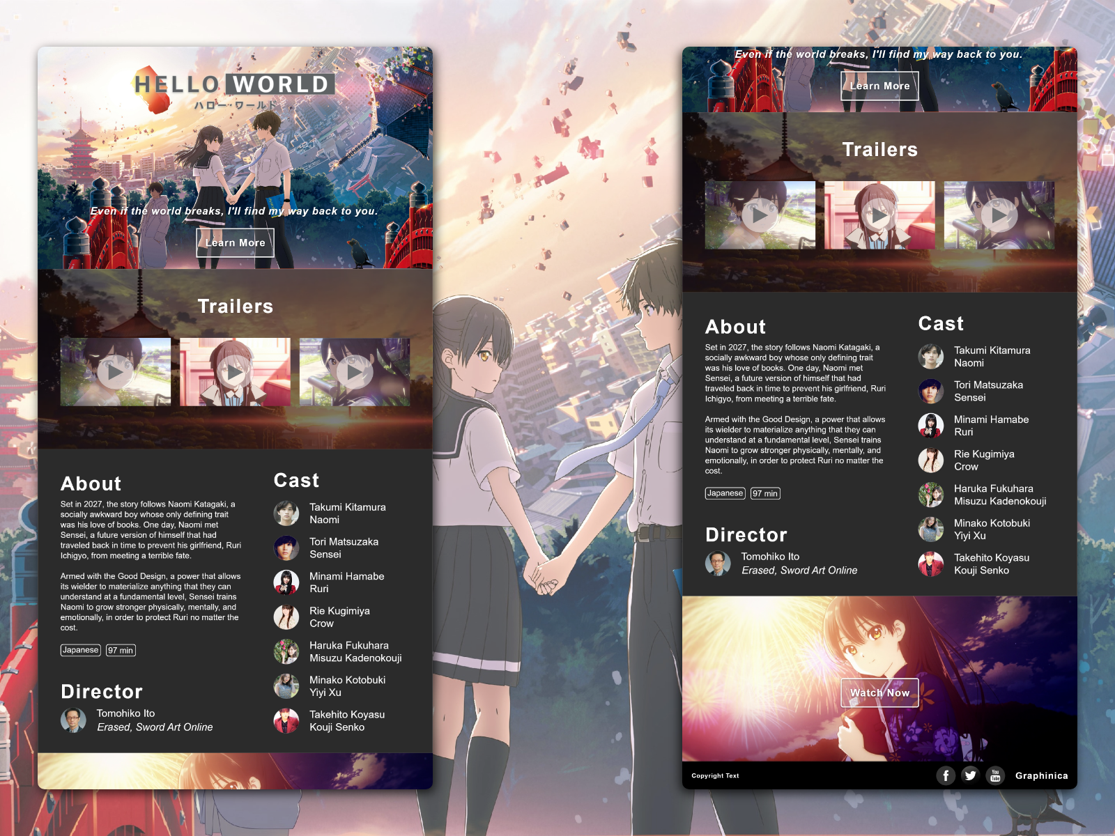
Around 6 months ago, I completed my first design concept for the anime movie Hello World. At the time, I was merely trying to replicate an existing design — the one used for the anime movie Your Name — and as I looked back, there’s definitely a lot of room for improvement. While the original design certainly tells visitors about the movie, it doesn’t necessarily sell the movie to them, which is essentially the primary goal of any site dedicated to a movie. Armed with better insights and understanding into UX and web design, I revisited my first design to make it better.
Goal
Redesign a movie website that both translates a foreign experience into English and markets the movie.
Problem Statement
I am an anime enthusiast
But I don’t understand Japanese
I want to see what a movie is about before I invest time into it
Process

The core process of this design largely mirrors the same process that I used for my Illustrator Portfolio Concept, but with the main difference being that the Research and Information Architecture phases were mainly done to examine how the initial design could be improved.
Research
My initial research began with auditing both my original design and the site it was based off of to evaluate what worked and what didn’t. For Your Name, the main conventions of a movie site — a hero image, synopsis, trailers, and casting information — were all present, but one of the most distracting features of the site was the constant reminder of the parent company that produced the movie. This is fairly common, as movie sites are often a branch of a producer or studio’s website, but it appears to sell visitors more on the studio rather than the movie itself. In advertising, the best advertisers are essentially invisible.
After reviewing a few contemporary movie sites that included a mix of both anime and Western-made movies, I found that:
- Sites for movies are largely similar in structure and content: The aforementioned conventions are largely present for practically all of the movie sites that I reviewed. It almost appeared like these type of sites didn’t have too much variation at all, and were only really differentiated by the type of movie and the studio/production company they were attached to.
- Sites for movies aren’t updated regularly: This is particularly prominent for Your Name, but also with a few other movie sites as well. For visitors navigating the movie’s site well after a theatrical release, they’re still presented with links to get movie tickets rather than to where they can buy or stream the movie. If a movie’s site is meant to serve as an ad (whether or not it’s effective presently), it needs to contain updated information that reflects the audience’s most prominent consumption habits. As of this writing, those consumption habits largely revolve around streaming.
As I looked back at my initial design, it was clear that I needed to accomplish a few things with my redesign:
- Grid-based formatting for responsive web design: The initial design had elements placed haphazardly based on relative distance to each other, therefore the structures would fall apart at different resolutions. Placing elements on a grid should rectify that while improving the general organization of the site.
- Improve the synopsis copy: Typically, a synopsis is treated like a pitch, but in the case of a foreign movie, a longer synopsis allows for more room to translate ideas that aren’t necessarily directly translatable, especially from Japanese to English.
- Conveying the movie’s feel and style through a gallery: A gallery is an opportunity to showcase key visuals from the movie, but it’s also an accessibility feature for those who may not be able to access the trailers due to connection speeds or data limitations.
- Reiterate where and how visitors can watch the movie: My initial design had a generic link to where visitors could watch the movie, but it didn’t explicitly communicate where the link would take them or how they would be able to watch the movie (e.g. buying a physical copy or streaming). Moving forwards, that should be clearly communicated throughout multiple points across the page as the primary purpose is for visitors to watch the movie.
Information Architecture
Once I identified areas of improvement through my research, it was time to rethink how to organize the site. As a single-page site, it was important to chart a journey from top to bottom, therefore it was important to establish a hierarchy of information to determine that journey. Based on the sites that I reviewed, I ranked sections of information based on how prominent they were across the sites I reviewed:
- Hero image/tagline: This was pretty universal and practically a standard. A hero image is the first key visual that a visitor sees, which may also be consistent with other ad forms (e.g. trailers, banner ads, etc.) that a visitor may have been exposed to prior to visiting the site. A tagline serves the same purpose, but in the form of a memorable phrase that encapsulates the movie.
- Trailers: Another universal and standard feature of a movie’s site. Trailers are edits from a movie that both showcase its overarching plot, introduces the main characters, and relays its genre and style.
- Synopsis: This section was included in some sites, but not all. For a foreign film, however, this section was an important inclusion as a trailer may not be fully capable of explaining the core elements of the movie outside of its intended audience. By having a synopsis, an explanation of the movie’s plot and characters can be tailored specifically to an international audience.
- Gallery: Some sites have different forms of a gallery (e.g. downloadable wallpapers, static images, etc.), but all of them serve the same function: showcasing key visuals.
Wireframing

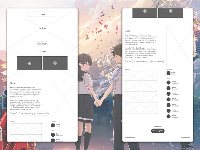
After finalizing the information architecture, I crafted a wireframe for the whole site. The structures largely resemble my initial design, but with a few key differences.
First, the synopsis (i.e. About section) was given its own dedicated subsection. This opens up more space to write a longer synopsis and other movie details (e.g. runtime, audio type, and subtitle availability). With the Gallery and Cast subsections, however, I opted for a more compact structure as neither section was as emphasized in established sites.
Final Render

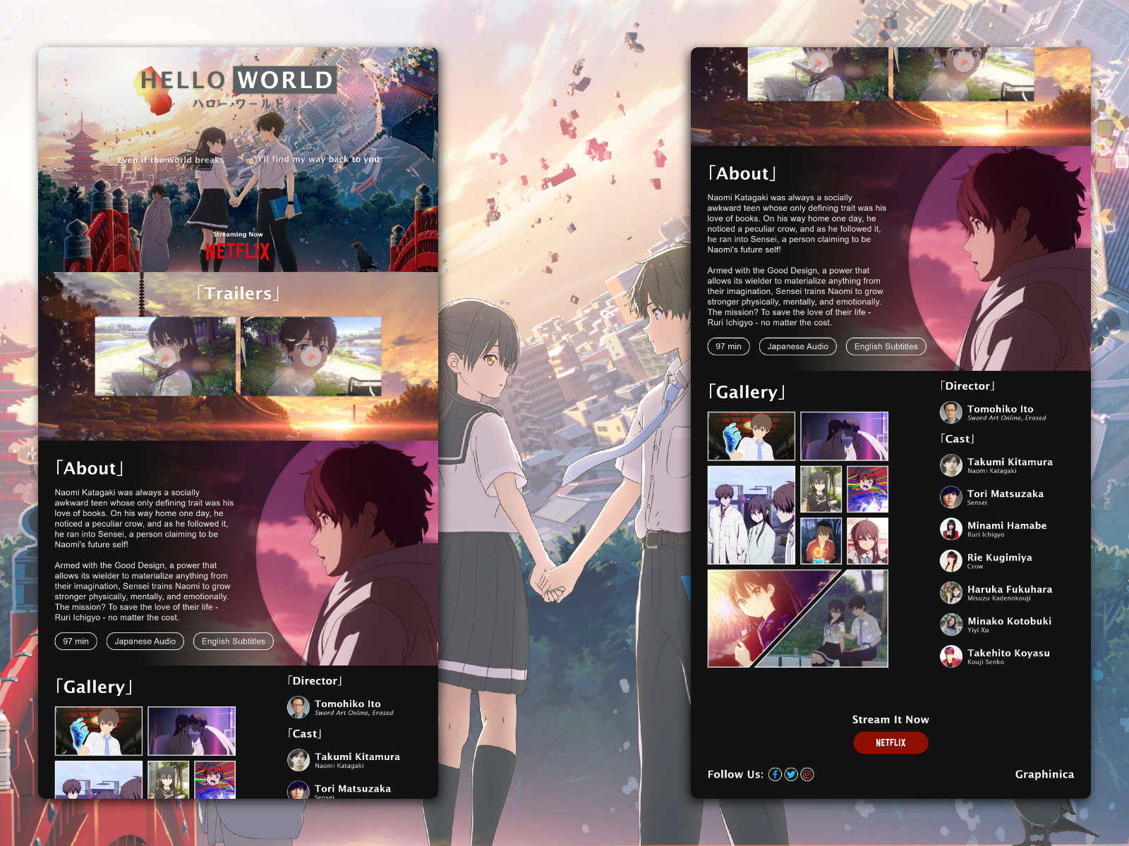
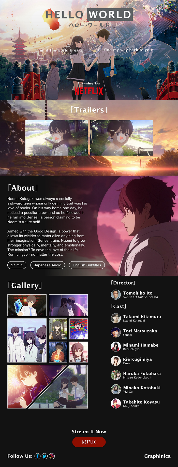
With the wireframes done, all that was left was to add in the visuals and stylings. The only major change that occurred between the Wireframing and Render processes was the Gallery. Like my Illustrator Portfolio Concept, I opted to style the image frames to reflect more of a manga art style, and I took the liberty to make the last two panels larger and asymmetrical to establish a sort of balance with the Cast section.
Specifications
Design Dimensions: Desktop (1920x1080)
Font Type: Lucida Sans
H1: 80-pt, demibold roman (Main Section Headers)
H2: 45-pt, demibold roman (Names)
H3: 35-pt, regular, 80% opacity (Work and Character Names)
Main text: 40-pt
Font color: #FFF
Column Layout: 8 (199px width, 24px gutter, 80px margin)
Lucida Sans was an ideal typography as it reflected the common sans-serif styles used for anime subtitles. Corner brackets (i.e. kagi kakko) were used to emphasize each section, and the tagline was broken up into two pieces. The latter was a stylistic choice, as each half of the tagline could be interpreted as dialogue between the two main characters, which could also be read from left-to-right or vice versa:
Even if the world breaks, I’ll find my way back to you.
I’ll find my way back to you, even if the world breaks.
Having the dialogue read from right-to-left is also a subtle nod to how text is read in many parts of Asia.
The thumbnail images for the trailers were also chosen specficially to incorporate a slight sense of immersion; with the current iteration, the characters can be perceived as looking directly at the visitor or to each other.
A key visual was added for the About section, which, like the trailer thumbnails, subtle directs visitors to read the text while showcasing the movie’s art style. Some subtle edits to the synopsis was also made to better summarize the movie’s plot for a Western audience.
Lastly, the bottom of the page contains all of the necessary references for a visitor to watch the movie or interact with the studio’s social media pages. This didn’t change drastically from the initial version, but was made more compact with a clearer call-to-action that explicitly tells visitors where they would be directed to (i.e. Netflix).
Conclusions
Revisiting my first concept site was an exercise in evaluating how far I’ve come since then, and I believe this new rendition is markedly better than the original. While there isn’t much room for user interaction as the page is essentially an ad for a movie, the information that has been standard for other movie pages are clearly laid out and easily accessible in a single-page layout. By taking into consideration the different cultural norms between Japan and the West, I believe this site would help to introduce Western audiences into the vast and diverse genre of anime.
There’s certainly room for more improvement, and perhaps in another 6 months, I’ll see what I can do to make this even better.
Thanks for reading! I’m currently looking for a full-time job, so if you’re reading this and liked my work, please e-mail me at theo.oing@gmail.com! Additionally, you can see my portfolio site, Behance, Dribbble, and LinkedIn to view more of my work!
